A logo incorporates your brand identity and is the focal point for your organization’s visual identity. Since this is what most people identify you with, you want to make sure your logo stands out, describes your message, and has good design elements. This article will concentrate on what to look for when choosing a logo design or hiring a designer.
1. Understand Why a Logo is Important
Your logo is important as a face for your business. It is where people identify you from your competitors. Making a good first impression and having your business look professional is key to the success of your business. Some of the most valuable benefits of a logo are business identity and driving buyer decisions. We identify images and graphics with meaning. Creating a graphic will achieve this recognizable association and incorporate your identity. From a single glimpse of a logo, consumers will make a judgement about the products, and services your company provides. It will convey the type and perception that your business portrays, influencing consumers to make decisions.
2. Define your Companies Identity
Analyze the goals, values and objectives of your business. How do you achieves your goals? What are your products and services? What makes you different from your competitors? Does your message and story convey your values? Your logo should reflect these concepts. For example, if you are a healthy fast food company where your main food is chicken, your logo needs to reflect those goals. Some of the questions that will help you establish your identity are what does your business want to accomplish, how do they want to do it. and how will your success be measured.
3. Find your Target Audience
For what type of consumer does your products and services provide? Is the majority of your consumer healthy, older, younger? What do they like to do? What is their profession? Do they have a profession? It is important to identify the groups your company’s services are good for. This is called your target market. A group of people with some of the same shared characteristics that your company has identified as potential customers. Finding your target market will help you make decisions. For example, your logo should look drastically different if your target market was children between the ages of 8-12, Rather than, if you audience were senior citizens.
4. Ideas and Inspirations
For ideas and inspiration look at other companies and competitors. This is a good starting point. However, to stand out from the crowd, it is not a good idea to create something that looks so similar that no one will differentiate you from your competitor.
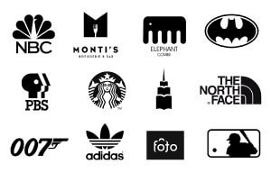
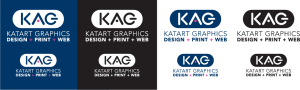
5. Create your Logo in Black and White First
Why create a logo in black and white? Color is a very powerful attribute. It can be overwhelming and sometimes hinder the design outcome. A good logo will stand out without color. There are many instances where it will be displayed in collateral that does not have color. When this happens, your logo might not look as good in black in white. Look at the strong examples below.
6. Think About the Memorable Aspects of your Design
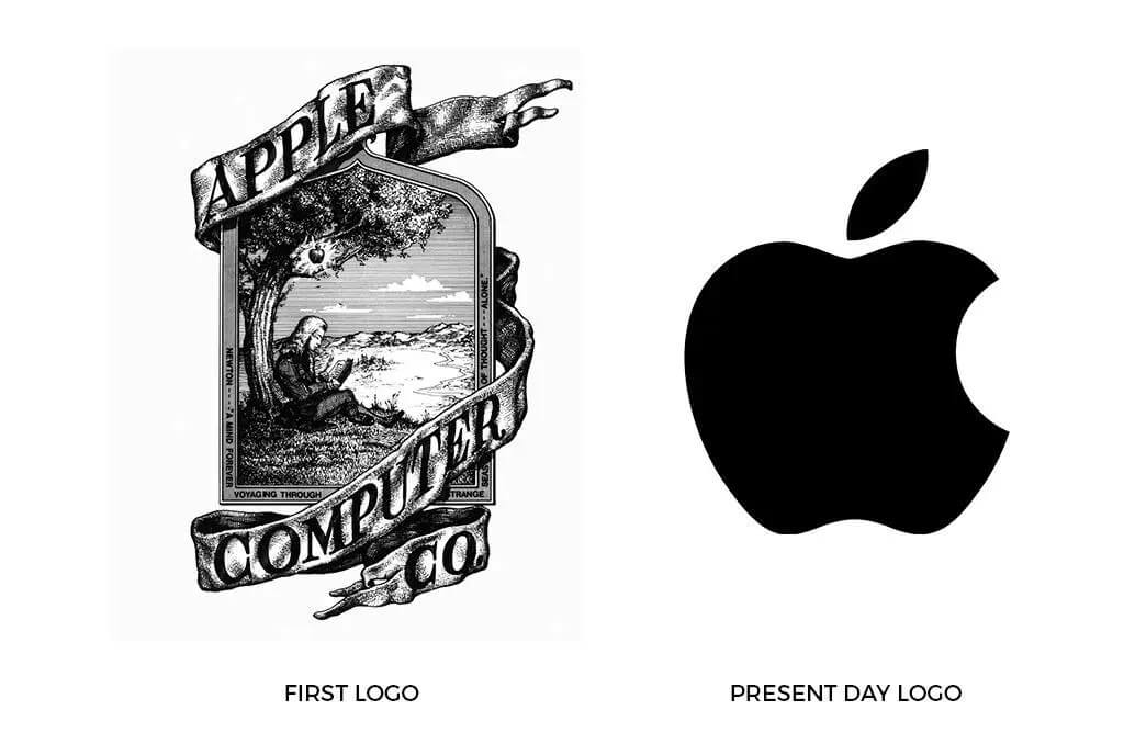
How can you determine if your design will be memorable? Sometimes it is hard to know what will be memorable. Normally, we can determine that text alone in a plain font will be the least memorable. However, when we associate a name with a popular business, that name tends to be more memorable, not from the design, but solely from the companies reputation. Take a look at Amazon, and when they first started. They did not have the logo that they have now, but everybody knew who Amazon (the name) was.
The bitten apple logo has been used countless of times before the computer giant, Apple, ever used it. Even though, popularity is a factor when it comes to memorability, there are a few helpful tactics to consider.
- One of the biggest tactics is simplicity. A really simple logo can often be recalled after as little as a brief glance, something that’s not possible with an overly detailed design.
- Strive to be different than you competitors. If all your competitors are using similar typography, colors, and a symbol placed to the left of their brand name, this is the perfect opportunity to set your logo apart rather than blend in.
- Don’t be to literal. A logo doesn’t have to show what a company does; in fact, it’s sometimes better if it doesn’t. More abstract marks are often more enduring. As mentioned before, The meaning of the mark in the eyes of the public gets added afterwards, when associations can be formed between what the company does and the shape and color of its mark.

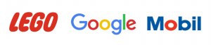
- Symbols aren’t essential. A logo doesn’t always need to be a symbol. Often an interesting font can work well, especially when the company name is unique – just think of lego, Google, and Mobil.
- Add an appealing element like Humor. Injecting a little wit or an appealing element into your logo can help it stand out. Your industry may have many companies identified with stuffy and sterile branding, and making something more whimsical could do the trick.
7. Consider the Message you Want to Express
Your logo needs to be relevant to the activities, ideas, and values it represents. The closer it is to your message, the easier it will be to sell your product and services to the client. A hot pink color will probable not go over big for a lawyers office and may make the client feel uncomfortable (since, pink is a color that evokes love, compassion, and romance). All colors, shapes, lines and symbols express certain feelings that represent something specific in a culture. It is essential to learn how these attributes convey visual language in a way that can benefit and ultimately express your message.
8. Think About the Feeling and Theme you are Trying to Convey
Perhaps your company has a broader target market reach. Conveying a feeling that is associated with most people could give you an edge for selling your products. Price Chopper, a popular chain grocery store, created their logo (an ax cutting the symbol of an American pie) to convey the theme of low prices. 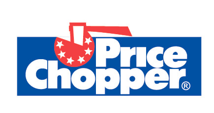
9. Get Feedback
When getting feedback it is important to establish criteria. Just like target marketing you need to know who the people are you are getting feedback from. Only getting evaluations from your employers may not be the best choice since they have invested interests. However, using the same target market that the logo is designed for, is optimal. In addition, setting up a rubric with judging criteria and questions can greatly help you decide.
10. Test your Logo in Different Media, Mediums and Sizes
Before you make a final decision, make sure you test your logo for all situations. It may appear impressive at its designed size, but you may find that your logo may not look as good when scaled down small. Your logo may look good on white paper, However bad on a darker shade of paper. Using mock ups will help you envision how it will look. Creating style guides can help you roll out your logo in different situations. Making a logo adjustable for those situations is part of the process.
Conclusion
Your company’s logo is an important aspect to your branding identity. Creating a memorable design can effectively convey your brand message and help you sell your products and services. The design of your company’s logo will influence people who see it and help them to make decisions. Hopefully with relevant values, benefits and services, they will choose your products and services.
If you need help creating a logo, KatArt Graphics can help. Call now to get a free estimate.